

In the week of February 11–17, 2026, approximately 13,000 Bitcoin moved from private wallets onto centralized exchanges. The total exchange reserve climbed from 2,738,959 BTC to 2,751,938 BTC, according to CryptoQuant’s exchange reserve data. We flagged this in Onchain Pulse #1 as the primary caution signal — the reason Bitcoin’s bounce from $60,000 was choppy rather than explosive.
That same metric has since become one of the most important things to watch in the current market. Reserves peaked at approximately 2.761 million BTC by late February before pulling back slightly to around 2.748 million BTC as of early March — still elevated, but showing early signs of easing. Understanding exactly what that shift means — and why it matters — is what this article is about.
Exchange reserves are one of the most direct, actionable onchain metrics available. They don’t require complex interpretation. They measure something simple: how much Bitcoin is sitting on exchanges right now, available to be sold. Here’s how to read them.
What Are Bitcoin Exchange Reserves?
Bitcoin exchange reserves are the total amount of Bitcoin held in wallets controlled by centralized exchanges — platforms like Binance, Coinbase, Kraken, Bybit, and OKX. CryptoQuant tracks this in real time by monitoring known exchange wallet addresses on the blockchain, aggregating the total BTC balance across all major platforms.
The key insight behind exchange reserves is behavioral. When Bitcoin is sitting on an exchange, it’s positioned to be sold. The holder has already moved their coins to the venue where selling happens. They may not sell immediately — but the optionality is there, and the supply overhang is real. When Bitcoin leaves exchanges for private wallets or cold storage, it’s moving in the opposite direction: away from the sell venue, into long-term custody. That removal of supply from the market has historically been one of the most bullish structural signals in Bitcoin’s onchain toolkit.
This is why the direction of change in exchange reserves matters more than the absolute number. Whether reserves are at 2.7 million or 2.9 million BTC is less important than whether they’re rising or falling — and how fast.
How to Read Exchange Reserve Data
There are two closely related metrics to understand: exchange reserve and exchange netflow.
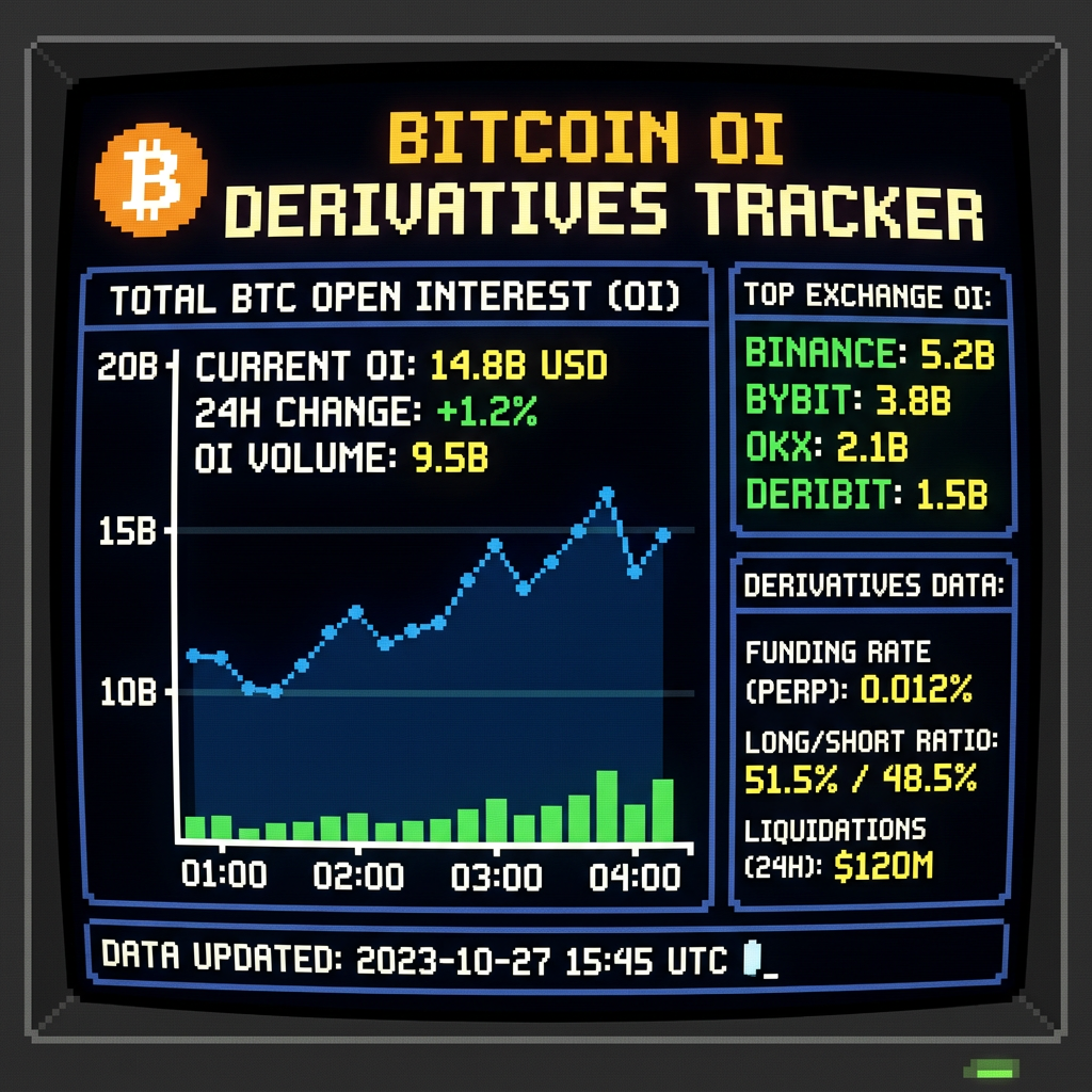
Exchange reserve is the running total — the aggregate BTC sitting on exchanges at any given moment. You can track this as a chart over time at CryptoQuant’s exchange reserve chart and CoinGlass’s exchange balance tracker. The trend line tells you whether supply is building or draining over time.
Exchange netflow is the daily or weekly change — inflows minus outflows. A positive netflow means more BTC arrived on exchanges than left. A negative netflow means more left than arrived. CryptoQuant’s exchange netflow chart is the cleanest place to track this on a free account. This is the metric you want to watch week-to-week because the reserve total changes slowly — netflow shows you momentum and direction in real time.
Reading the signals:
- Rising reserves + positive netflow = more BTC moving to exchanges than leaving. Sell-side supply is building. Historically a headwind for price.
- Falling reserves + negative netflow = BTC leaving exchanges for private storage. Supply is draining. Historically a tailwind for price — the setup that preceded every major Bitcoin bull run.
- Flat or mixed signals = equilibrium. Buyers and sellers roughly balanced. Price typically consolidates in these conditions.
The Historical Context: Why Falling Reserves Preceded Every Major Bull Run
To understand why exchange reserves matter so much, you need to see what they looked like during Bitcoin’s most significant price runs.
The 2020–2021 bull run was preceded by one of the most dramatic exchange outflow periods in Bitcoin’s history. Between January 2020 and January 2021, over 500,000 BTC left centralized exchanges. Reserves fell from approximately 3.1 million BTC to 2.6 million BTC as institutional buyers, long-term holders, and newly minted HODLers pulled their coins into cold storage. The result was a genuine supply shock — less Bitcoin available to sell, against rising demand — that helped drive prices from $8,000 to over $40,000 in twelve months.
The pattern repeated, more compressed, in the recovery from the 2022 bear market. As Bitcoin bounced from the $16,000 lows of the FTX collapse, exchange reserves resumed their long-term downward trend. By the time Bitcoin was approaching its 2024 pre-halving all-time high of $73,000, reserves had fallen to some of their lowest levels on record — with CryptoQuant data showing exchanges holding fewer coins than at almost any point in the prior four years. Less supply on exchanges plus surging ETF demand created the conditions for price discovery.
The 2025 peak and subsequent correction showed the opposite dynamic. As Bitcoin approached and then exceeded $100,000 in late 2024 and early 2025, exchange reserves began creeping back up — holders distributing into strength, moving coins back to exchanges to sell into the rally. That rising exchange supply contributed to the conditions that led to the eventual correction from the $126,296 October 2025 all-time high.
What Exchange Reserves Are Telling Us Right Now
The current picture is genuinely mixed — which is useful information in itself.
Starting from the historic low of approximately 2.718 million BTC on January 19, 2026, exchange reserves climbed steadily through February, peaking at roughly 2.761 million BTC by late February before pulling back slightly to around 2.748 million BTC as of early March. That’s a net increase of approximately 30,000 BTC from the January low to the February peak — a meaningful addition to exchange-held supply during a period when Bitcoin was trying to recover from the February 5 crash.
This is why, as we noted in Onchain Pulse #2, the recovery from $60,000 has been choppy rather than explosive. More Bitcoin on exchanges means more available sell pressure at every price level. Every bounce gets met with sellers who moved their coins to exchanges during the correction and are waiting to distribute.
However — and this is important — there are two countervailing signals that complicate the bearish exchange reserve read. First, long-term holder (LTH) illiquid supply has simultaneously reached multi-year highs. The coins that aren’t on exchanges are largely in the hands of conviction holders who aren’t selling regardless of price. Second, U.S. spot Bitcoin ETFs recorded approximately $787 million in net inflows in the final week of February — ending a five-week streak of outflows. Institutional demand is re-emerging even as exchange supply remains elevated.
This divergence — elevated exchange reserves (bearish) against rising ETF inflows and record LTH supply (bullish) — is the defining tension in Bitcoin’s current market structure. It’s the same “flow war” dynamic we’ve been tracking in the Pulse reports since February.
The Level to Watch: When Does the Caution Signal Clear?
Exchange reserves don’t need to fall all the way back to January’s 2.718 million BTC low for the signal to turn constructive. What matters is sustained directional change. Three consecutive weeks of negative netflow — more BTC leaving exchanges than arriving — would indicate that the distribution pressure from February is clearing. A return to meaningful outflows of 5,000–10,000 BTC per week would materially change the supply picture.
You don’t need to check this daily. Weekly is sufficient. Pull up CryptoQuant’s exchange netflow chart once per week and note whether the reading is positive (inflow, caution) or negative (outflow, constructive). The 7-day moving average smooths out the noise and gives you the clearest directional read.
Exchange Reserves vs. Exchange Netflow: Which to Watch?
Both metrics are useful but serve different purposes. Exchange reserve is the big-picture, slow-moving indicator — it tells you the structural supply backdrop over months and years. It’s most useful for understanding where we are in a cycle relative to prior peaks and troughs. When reserves are near historic lows (as they were in early January 2026), the long-term structural picture is bullish. When reserves are building toward historic highs, distribution is likely underway.
Exchange netflow is the tactical, week-to-week signal — it tells you what’s happening right now and which direction supply is moving. This is what you check regularly to track momentum. A single week of heavy inflows might be noise. Three consecutive weeks of inflows is a trend. Three consecutive weeks of outflows is a meaningful constructive signal.
For a complete picture, always read them together. The combination tells you both where the trend is coming from and where it’s going.
Common Mistakes When Interpreting Exchange Reserves
The biggest mistake retail investors make with exchange reserve data is treating any inflow as automatically bearish and any outflow as automatically bullish. Context matters enormously.
During a healthy bull market, some Bitcoin will naturally flow onto exchanges as profit-takers liquidate gains — this is normal and doesn’t necessarily signal an impending crash. Similarly, during a bear market, some Bitcoin will flow off exchanges as capitulated sellers have already sold and remaining holders move to cold storage — this can happen even as price continues falling. The signal becomes significant when the magnitude and duration of the flow is unusual relative to recent history.
The second mistake is ignoring the broader context. Exchange reserve data is most powerful when read alongside the metrics covered in our Bitcoin Onchain Glossary — particularly STH-SOPR (are the coins moving to exchanges going to be sold at a profit or loss?) and Thermocap Multiple (what is the long-term cycle context for this supply shift?). No single metric tells the complete story.
How to Check Exchange Reserves for Free
You need no paid subscription to track this metric. CryptoQuant’s exchange reserve chart is free and updates daily — it’s the industry standard and the source most analysts reference. CryptoQuant’s exchange netflow chart shows you the directional flow. CoinGlass’s exchange balance tracker breaks reserves down by individual exchange, which is useful for seeing which platforms are seeing the most inflows or outflows at any given moment.
Add one of these to your weekly onchain checklist. It takes under two minutes to check and provides genuinely useful context about the current supply backdrop — context that most retail investors never see because they’re only watching price charts.
The Bottom Line
Exchange reserves are one of the cleanest behavioral signals in Bitcoin’s onchain data. They don’t measure sentiment or speculation — they measure what holders are actually doing with their coins. Moving to an exchange means positioning to sell. Moving off an exchange means positioning to hold.
Right now the data is telling a transitional story. February’s elevated inflows built sell-side pressure that capped the recovery from the $60,000 crash. Early March is showing the first tentative signs of that pressure easing — reserves pulling back slightly from their February peak, ETF flows turning positive, LTH supply holding at multi-year highs. None of that is a confirmed reversal signal yet. But it’s the right direction.
We track exchange reserve and netflow data every Monday in the Onchain Pulse alongside MVRV, SOPR, ETF flows, and realized price. Subscribe below to get the weekly read in your inbox before the trading week begins.
Exchange reserves are most useful in context with the full onchain framework. See our step-by-step beginner’s guide to Bitcoin onchain analysis and the 10 best free onchain tools. Our deep dives on NVT Ratio, Realized Price, MVRV Z-Score, and the Hash Ribbon cover the other core metrics. The 7 onchain indicators that signal Bitcoin cycle tops shows how exchange reserves interact with cycle analysis, and our guide to identifying Bitcoin accumulation zones applies several of these signals to real buying setups.
Sources
- CryptoQuant — Bitcoin Exchange Reserve Chart (live, free)
- CryptoQuant — Bitcoin Exchange Netflow Chart (live, free)
- CoinGlass — Bitcoin Exchange Balance Tracker by Platform
- Crypto Times — Bitcoin in Geopolitical Jitters: Rising Exchange Supply Meet Illiquid HODLing (March 2, 2026)
- SoSoValue — U.S. Bitcoin Spot ETF Flow Dashboard
- Onchain Decoded — Onchain Pulse #1: Bitcoin’s $3.2B Crash — What the Data Actually Shows
- Onchain Decoded — Onchain Pulse #2: Is the Bitcoin 4-Year Cycle Dead?
This article is for educational purposes only and does not constitute financial advice. Always do your own research.
Let’s Connect:
Follow us on X: https://x.com/OnchainDecoded
Join our Telegram channel: https://t.me/onchainnewsblog
Subscribe to our newsletter: https://onchainnews.blog/newsletter-alpha/
Disclaimer
The information provided in this article is for informational and educational purposes only and should not be construed as financial, investment, or trading advice. Onchain News does not provide recommendations to buy, sell, or hold any asset, and nothing here should be taken as a guarantee of future performance. Always conduct your own research and consult a qualified financial professional before making any investment decisions. Cryptocurrency markets are volatile and you are responsible for your own risk.

Leave a Reply